Counter opinions
- Thread starter footsteps
- Start date

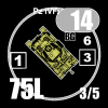

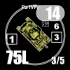
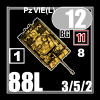
They will work. although it may be hard to read what kind of vehicles as the names look too small. Might I suggest using a white on red for the large target, as you have done (white on grey) for the small target.
Brad M-V
Senior Member
The counters look really nice, but the light grey needs to be much darker so the white pops more. The light grey looks too washed out imho.
witchbottles
Forum Guru
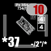
these do look better than the first set, on my older eyes. Hard to read that Tiger's AF on the background, you may need to tweak it on the palette a bit to better see the "11" AF.
Jazz
Inactive
AFV name (e.g. Pz IV F2) is still way too small and hard to read....which is about the only thing I have trouble reading on the current counters.
footsteps
Just visiting
I'm looking for a place to operate a laser cutter - then I can proceed.I wish you'd just bring these to market like CH did. They basically took your idea and are printing it on demand.
footsteps
Just visiting
I also have the name on the Wreck side.AFV name (e.g. Pz IV F2) is still way too small and hard to read....which is about the only thing I have trouble reading on the current counters.
I find I need a 2nd or 3rd look at them to read the factors.
Armament:
Having the MA or MG factors partly overlap the 1MT/RST/ST/T graphic means that they become a blob. Even having a thin black line between the Tiger's ST and MA+MG would make a huge difference. I would recommend that even if it meant a small reduction of the MA text.
Armour:
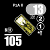
The white on grey for the Hotchkiss front AF is a disaster. You used white outlined red for the Tiger, that works, why not use a similar white outlined black for the Hotchkiss or alternatively black number on a white circle. That second alternative might mean you have the front AF as black on white circle and the side/rear as white on black base, but while being an aesthetic mismatch, would be much, much more readable. I would not bother about having the Tiger's front AF box as red outlined with white, a plain white box would do fine, while keeping the white outlined red 11 AF.
MP:
Again a major readability problem. Doing the Pz IV and Tiger with black MP would be an improvement. The problem with that would be with other MP types, like H/T, AC and Truck types where the lettering would be in direct contact with the black base colour in places. Like the AF, black lettering with a thin white outline would be a solution.
Overall for data:
Where there was black on blue base, use white on black. Where there was black on white use black on white. Where there was black that was spread on both white and blue base use white outlined black. The fewer changes the better.
I am not too fussed about the name size, having it on the wreck side as well works for me. It's not too often you really need the name and thus the reference back to the chapter H notes during a game. MP, AF, MA, MG factors are a different matter.
Armament:
Having the MA or MG factors partly overlap the 1MT/RST/ST/T graphic means that they become a blob. Even having a thin black line between the Tiger's ST and MA+MG would make a huge difference. I would recommend that even if it meant a small reduction of the MA text.
Armour:
The white on grey for the Hotchkiss front AF is a disaster. You used white outlined red for the Tiger, that works, why not use a similar white outlined black for the Hotchkiss or alternatively black number on a white circle. That second alternative might mean you have the front AF as black on white circle and the side/rear as white on black base, but while being an aesthetic mismatch, would be much, much more readable. I would not bother about having the Tiger's front AF box as red outlined with white, a plain white box would do fine, while keeping the white outlined red 11 AF.
MP:
Again a major readability problem. Doing the Pz IV and Tiger with black MP would be an improvement. The problem with that would be with other MP types, like H/T, AC and Truck types where the lettering would be in direct contact with the black base colour in places. Like the AF, black lettering with a thin white outline would be a solution.
Overall for data:
Where there was black on blue base, use white on black. Where there was black on white use black on white. Where there was black that was spread on both white and blue base use white outlined black. The fewer changes the better.
I am not too fussed about the name size, having it on the wreck side as well works for me. It's not too often you really need the name and thus the reference back to the chapter H notes during a game. MP, AF, MA, MG factors are a different matter.
Michael Dorosh
der Spieß des Forums
- Joined
- Feb 6, 2004
- Messages
- 15,733
- Reaction score
- 2,765
- Location
- Calgary, AB
- First name
- Michael
- Country
-

Put the Chapter H number in the top left corner and skip the name altogether. Printing white letters on grey turret rings means you aren't going to be able to read it anyway. And, it would be a way to further differentiate yours from the official counters.I also have the name on the Wreck side.
Agreed. Otherwise very nice.AFV name (e.g. Pz IV F2) is still way too small and hard to read....which is about the only thing I have trouble reading on the current counters.
AZslim
Elder Member
They need SKULLS. Otherwise very pretty.
Gunner Scott
Forum Guru
He is too scared of pitmann to do that.
They need SKULLS. Otherwise very pretty.
Whiskers1123
Member
I'll buy them if they have Skulls. Hurry up Footsteps!
footsteps
Just visiting
They need SKULLS. Otherwise very pretty.
Gentlemen,I'll buy them if they have Skulls. Hurry up Footsteps!
There will be no skulls, or runes. Not even a rat's anus.
This is because of the European market, where such symbols are banned (okay, not the rat's anus).
Mark has nothing to do with this. So, Scott, please go be fruitful and multiply with yourself. I'm fed up with your childish tirades on this topic. You need to grow up, grow a pair, and become aware of the world outside your little corner of Illinois (or where ever your cave is located).
Gunner Scott
Forum Guru
Grow a pair ya coward.
Gentlemen,
There will be no skulls, or runes. Not even a rat's anus.
This is because of the European market, where such symbols are banned (okay, not the rat's anus).
Mark has nothing to do with this. So, Scott, please go be fruitful and multiply with yourself. I'm fed up with your childish tirades on this topic. You need to grow up, grow a pair, and become aware of the world outside your little corner of Illinois (or where ever your cave is located).
Whiskers1123
Member
Do a set for the US market with Skulls. Nothing is banned in the good old USA!