I have played with the counters only twice so far, but punched, clipped and organised around 20 countersheets. My (of course, very preliminary) experience:
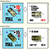
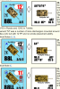
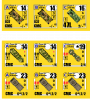
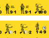
The larger and thicker/blockier numbers are better visible than on standard counters. That is a good thing. However, a specific (and modernist) design approach of BG is to let the figures and numbers bleed together. While attractive when looking at an individual counter - and especially blown up - it becomes more difficult to quickly identify the numbers when you have several of the counters strewn about.
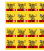
In general, standard counters have much more of "empty" space. BG's counters are not only spread out towards the sides more (I guess thanks to currently available and more precise die cutting technology) and thus use more space of the counter, but all the graphic elements, including the figures, have been made bigger. In addition, the counters use a larger colour palette (obviously). This makes the counters "fuller" and therefore possessing less visual contrast - and I find that somewhat of a problem. Although an individual counter is perhaps more attractive (although the starkness, simplicity and contrast of the standard counters has its attractiveness too), it becomes more difficult to tell the individual categories of counters apart. It is more difficult to quickly distinguish between a squad and a halfsquad, for example. Sorting your counters takes more time.
Has anybody had a similar experience?