seblick
Member
- Joined
- Sep 18, 2016
- Messages
- 31
- Reaction score
- 16
- Country
-

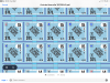
Only sheet 9.Is this only on Sheet #9?
Only sheet 9.Is this only on Sheet #9?
"Which of these things are not like the other?"It looks like the vehicle outlines are a little thick, but everything looks perfectly legible--not smeared or anything. Am I missing something?
No. I haven't noticed anything that I might consider smudges or poor printing. Thanks for asking!"Which of these things are not like the other?"
I stated that it was the vehicle images that were faulty, so, yes... you apparently missed something.
And before a troll scold inevitably appears, I merely asked if anyone else experienced poor printing on sheet 9. Not a problem practically, but certainly undesirable and not acceptable to any printer concerned with professional results. Thanks for your interest.
I'd say that's a pronounced difference in quality.Attached is a sample of the sheet 9 and a sample of similar counters from BV.
Back off about 2 feet, it will all come back into focus!I can’t see the vehicles anymore. They all look like black rectangles. Real small black rectangles.
So are you actually saying that any of the text or numbers are hard to read or are you not saying that but rather saying that some of the vehicle depictions have thick lines.hello all
I noticed my pz 38's a bit hard to read, kinda thick. looked like those pics
alan
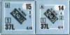
The vehicle image and the lettering on the counter image on the left (the new counter artwork) looks terrible. I really wish I had seen these images prior to dropping so much money on this product. Worst of all, someone actually proofed these counters during some phase of production and didn't think there was a problem.View attachment 12255
The newer ones seem to have cramped letters, probably used a bold font rather than the tall font of the originals. The image is slightly bigger, but also less detail in the vehicles. It's a negligible change, but the letters are slightly harder to read. How big a problem is it? Well, you only really need the name of the vehicles when pulling counters, and I think most people use the other characteristics to do that. But are the counters objectively as good? From what was posted, I'd say it's a slight quality drop that probably has little actual effect. By the same token it's noticeable and silly to pretend it isn't there. I'd say the chief improvement is removing a couple of millimetres of dead space from the borders, and better centring and color registration.
Playing ASL is a first world thing, anyway.First world problems....
As someone who "actually proofed these counters" - I can say that the proofing PDF files look just fine. So to me this looks like a printing issue.Worst of all, someone actually proofed these counters during some phase of production and didn't think there was a problem.
It sure sounds to me that some countersheets from some people have printing issues in CdG/Dinant.I tried very very hard to look for something to complain about ...