Help needed: Nationality colour matching

footsteps

Just visiting
Joined
Oct 19, 2007
Messages
7,383
Reaction score
3,539
Location
Ontario
Country
llCanada
Being slightly colour blind makes it a challenge for me to figure out the colours I'm looking at. So I'm asking for help.

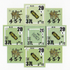
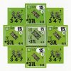
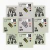
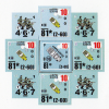
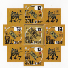
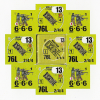
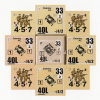
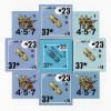
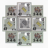
Below are rosettes of counter images in the basic nationality colours (exc: Japanese). In the centre is an official counter, and surrounding that are four pairs (1/2" & 5/8") of colour samples. One of the samples uses the CMYK values from the Texas ASL site. The others are my (questionable) attempt at variations towards a closer match.

What I see on my screen is not necessarily what comes out on paper.

The vehicles have letter designations, so use those to identify the pair that either matches the official counters, or is closest to a match. If the latter, please suggest what change needs to be made (i.e. brighter/darker; more/less RGB/etc.; and so on).

Thanks for your help.
 

Philippe D.

Elder Member
Joined
Jul 1, 2016
Messages
2,140
Reaction score
1,399
Location
Bordeaux
Country
llFrance
Not sure how to describe it; the French are the worst, B is too close to German colors (and this is a problem since there are many French vs German scenarios) and the others, I'd say, have too much yellow.

The others are not perfect matches (but if it's for printing quality counters, you need real calibration on the printed stuff), but are all close enough that there would be no confusion.
 

Tuomo

Keeper of the Funk
Joined
Feb 10, 2003
Messages
4,654
Reaction score
5,540
Location
Rock Bottom
Country
llUnited States
Oof. From what I've heard, matching printed colors is hard and really takes the skill of a Real Genuine Printer - ie, don't try this at home. The particular idiosyncracies of your monitor and printer just can't be duplicated on Other People's Stuff, without serious color-matching addons that few people have. So for us to look at these images on our RGB monitors and try to advise you about how they're going to print.... well, I'd have low expectations here.

Plus plus, the media are different - the real counters have subtle mottling that digital images don't. UNLESS of course you add that mottling yourself. Which is easily doable and would probably come out SuperKewl. Go to subtletextures.com and download something that looks good. Add it to your image in Overlay or Multiply mode (for gimp) and sit back and go OOH AAH. I've said it before - that subtle mottling is the shizzle. Makes the Open Ground on the FB map look 10 times better.

All that said - let's offer some free advice. IMO, and YMMV. Your eyes are different than mine.

Axis Minors - too saturated. Lower the saturation then play with lightness
Americans - too bright, then too saturated. (ie, lower the brightness a bit, then lower the saturation)
Allied Minors - a *little* too blue. Otherwise seems very close.
French - Lord help us. Variation all over the map. A, C, and D are too purple (ie, lower the red). Then see where you are.
British - Lower the saturation a bit, then the brightness a bit. D is the closest in color but I can't describe what you need to do to get it closer. Play with it :)
Finns - THE FINNS ARE FINE, HOW DARE YOU IMPLY THERE'S A PROBLEM WITH THE FINNS. (Actually, A is the closest by far, but needs to be desaturated just a bit)
Germans - how'd you get the striped central counter? Anyway, A is the closest in color, but could be bumped up in saturation.
Italians - A is SPOT ON. Who'da thunk the Italians would get it right?
Russians - Everything is too orange - slide your Hue slider to the left and lower your saturation - you'll enter Brown Territory and then have a lot of room to play with. The Russians are weird, anyway - every new Module seems to offer an exciting variation on tan/brown/orange.
 

Tuomo

Keeper of the Funk
Joined
Feb 10, 2003
Messages
4,654
Reaction score
5,540
Location
Rock Bottom
Country
llUnited States
BTW, a side note commentary on Those Who Make ASL Stuff.

Pause for a second and think about what Alan's asking, and how long it took him to just put those examples together. I'm guessing probably an hour or so, and even for Counter Trolls, an hour or so of futzing around with minor color variations just to make some examples to attach to a Forum post to maybe get some advice that that may eventually lead to better colors .... is really not exciting work. Nobody's gonna go, "Ooh, aah, that's awesome, you're talented, where can I buy it?". This is drudgework. Basic stuff. Blocking and tackling. UN-sexy.

Alan does it, and Alan is successful, because he puts in the time like that. AND he's talented. (And his Significant Other is probably very understanding).

The number of people who play ASL AND want to make stuff AND have the basic creativity AND are willing to put in the time and energy on drudge work is really small. The adulation from the masses is great, but for every one of those moments, there's like 50 moments of work and dedication.

Good on ya, bro.
 

RobZagnut

Elder Member
Joined
Apr 1, 2003
Messages
8,814
Reaction score
1,378
Location
USA
Country
llUnited States
They all look good to me except for the French. Needs deeper blue, but less red.
 

footsteps

Just visiting
Joined
Oct 19, 2007
Messages
7,383
Reaction score
3,539
Location
Ontario
Country
llCanada
Thanks for the feedback so far.

I guess I should reveal which ones use the Texas ASL values:

AlM: A
US: B
AxM: B
UK: A
FI: A
FR: B
GE: A
IT: A
SO: A

As for the striped German vehicle, that's an effect of the scan. The counter (from HP) is solid. The Finnish and Soviet vehicles are also from HP. The Minors are from AoO and DB (latest version for each). The rest are "originals".
 
Top