Looking at the counters, here is what I think.
Positive:
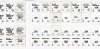
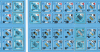
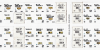
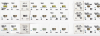
The colors and thickness of the coutners seems to be good.
The data that is used
during the game is more legible compared to the "traditional" counters, which is nice for those ASLers getting older and having issues with eyesight.
For those who like colored units - well, now you got'em.
Negative:
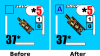
The AFV depictions seem to be smaller compared to the "traditional" counters. I understand, that the size of the depiction has been increased by footsteps for his counters after some criticism on that point. Yet they are
still smaller than on the "traditional" counters. I cannot fathom why. At least in the examples given here, there would have been enough space to make the depictions larger or at least the same size as on the "traditional" counters. For those 'grapically' oriented, this might be a significant drawback.
The Vehicle Types are in an extremely small font - smaller compared to the "traditional" counters. In addition, they are often printed in a location where part of the font is on a colored background and part on some white background for turret designations. If providing better readability was the objective for these counters, this was counterproductive.
The smaller vehicle depictions paired with the colors make them harder to discern, than the "traditional" counters. This is aggravated by the smaller font for the vehicle types. So while the readability of values used
during the game has improved, the readability for purposes of picking the counters
before and sorting them back
after the game has worsened.
I believe that these drawbacks could have been at least partially avoided, as they have been pointed out by several people during the (very positive) feedback-process here in this forum both by forumites and the designer. Might be a bit of a lost opportunity in my eyes as I think a fully positive solution (from my POV) could have been realized.
von Marwitz