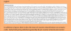
This is your "illustration" in your blog post
View attachment 17508
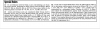
This is what it actually looks like in the latest DftB scenario cards
View attachment 17509
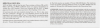
This is a comparison from a CdG2 scenario
View attachment 17506
- RE: the illustration in your post - I am guessing that the actual page do not start and end with the text box. The ACTUAL page and therefore the ACTUAL margin is wider than what you chose to show. Had I choose to make a cutout from ANY publisher's scenario card cutting REALLY close to the text, I can achieve the same effect you did with your DftB cutout.
- We are not Page Layout Artist United discussing whatever inherent evils you try to imply with "full justified text appearing in boxes with extremely small margins". Your blog singled out the DftB as "a notorious offender" with layouts that "really punish the eyes", so I take your point as one of readability. I agree with you, that example you showed is hard to read, especially if the page starts and ends with the text box.
- The latest examples I pulled from recent scenarios are both pretty easy to read, text box notwithstanding. Notice also, I didn't lower the resolution in my examples like you did in your blog post.
- Hang on .. did you have a problem with "full-justified text" as well?
Can you tell me that the latest DftB layout "really punish the eyes"?
Mark, "you know I’m a fan of your [blog], which has many good qualities", but to single DftB out and make that general "hard to read" assertion based on a cut out from an old issue without any reference to improvements made in newer ones is misleading at best and does your readers no favors.