I agree that getting the right thickness of the white around the figures can be difficult, I think you got it right, just enough to provide contrast without dominating the figures.
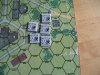
The text, eg 4-4-7, is not quite right. The overall height and width of each character is fine, it's the 'thickness' of each stroke/arc that I am less than enamoured with. Over increasing the thickness takes away from 'interior' black, eg the interior black triangle of a "4" or the interior dots of an "8", so at a distance with with not great eyesight you end up with a greyish white blob. Of course there will always be a distance at which anyone will not be able to read the text on a counter, but delaying that should be the aim.
A very, very minor thing: You use dots "." to separate the 4.4.7 values, I would prefer squares which would be more in line with the conventional dashes in appearance. I suspect that a full 'dash' would take up too much space, but a square would keep with the 'spirit' of existing counters.
I confess that I have been taking little attention of your 1/2" counters compared to your 5/8" ones, AFV and gun data values being my forte.