Broken Ground Design Counters

takai

Member
Joined
Apr 4, 2013
Messages
762
Reaction score
117
Location
Europe
Country
llSwitzerland
I appologize if this has been discussed before. I tried the search and it didn't turn up anything useful.

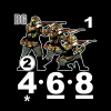
It is impossible not to notice Alan peddling his fledgling product, and I applaud the effort! However there seems to be precious little information available regarding quality. From the various counters published, I can tell all about the design aesthetics: they look very nice. My wife called them cute.

But what about printing and die cutting process? What kind of cardstock will they be printed on? Do we get full OOBs or just partial ones? Do they mix with MMP counters?

Thanks for any info - I'd rather not shell out 500 bucks for the GROFAZ bundle and then be disappointed.
 

footsteps

Just visiting
Joined
Oct 19, 2007
Messages
7,383
Reaction score
3,539
Location
Ontario
Country
llCanada
Good questions all round.

In terms of specs, the cardstock is 0.06" thick +/- 0.001 (depending of glue thickness). It took three iterations to get that sorted out. If you look at the edge of BFP counters, that's what these counters will look like - a sandwich of centre core with white paper top/bottom.

This weekend I'm putting the finishing touches on four sample sheets (two of 1/2"; two of 5/8" counters). These samples will be digitally printed, as this run is too small for 4-colour printing, and two custom dies are being made. With this batch I hope to have "live" examples of my work. When full production starts, printing will be 4-colour.

The OOBs are complete (Exc: no bridgelayers) plus extras. This is for ETO/DTO - if something is available only in CoB/GH/RS, it probably isn't in the mix (yet).

Six pairs of eyes in three countries are proofing the sheet layouts (and counter values), so I expect errors to be minimal. I can't guarantee perfection, but I think the results will be pretty good.

I agree that the GROFAZ price gives pause for thought. That's why I'm investing about C$3,000 (~U$2,400) in getting these sample sheets printed/die cut.
 

takai

Member
Joined
Apr 4, 2013
Messages
762
Reaction score
117
Location
Europe
Country
llSwitzerland
Good questions all round.

In terms of specs, the cardstock is 0.06" thick +/- 0.001 (depending of glue thickness). It took three iterations to get that sorted out. If you look at the edge of BFP counters, that's what these counters will look like - a sandwich of centre core with white paper top/bottom.

This weekend I'm putting the finishing touches on four sample sheets (two of 1/2"; two of 5/8" counters). These samples will be digitally printed, as this run is too small for 4-colour printing, and two custom dies are being made. With this batch I hope to have "live" examples of my work. When full production starts, printing will be 4-colour.

The OOBs are complete (Exc: no bridgelayers) plus extras. This is for ETO/DTO - if something is available only in CoB/GH/RS, it probably isn't in the mix (yet).

Six pairs of eyes in three countries are proofing the sheet layouts (and counter values), so I expect errors to be minimal. I can't guarantee perfection, but I think the results will be pretty good.

I agree that the GROFAZ price gives pause for thought. That's why I'm investing about C$3,000 (~U$2,400) in getting these sample sheets printed/die cut.
Thanks, Alan - that was exactly the information I'm looking for.

Are you printing with the same company as MMP and BFP do?
 

footsteps

Just visiting
Joined
Oct 19, 2007
Messages
7,383
Reaction score
3,539
Location
Ontario
Country
llCanada
Thanks, Alan - that was exactly the information I'm looking for.

Are you printing with the same company as MMP and BFP do?
Nope, all local. All-Canadian, all the way. That way, I can sit down with the people doing the work for me, over a cup of coffee, to talk through all the specs etc.
 

takai

Member
Joined
Apr 4, 2013
Messages
762
Reaction score
117
Location
Europe
Country
llSwitzerland
You've definitely wetted my appetite now. As this will surely be a collectors item, I'll have to think about raising some funds now.

In any case I wish you good business.
 

volgaG68

Fighting WWII One DR At A Time
Joined
Jun 15, 2012
Messages
3,212
Reaction score
1,549
Location
La Crosse, KS
First name
Chris
Country
llUnited States
But what about printing and die cutting process? What kind of cardstock will they be printed on?
Good question, as this was my only real concern. I agree they look nice, it is the physical construction of the counter quality I was left to question about. Personally, I like the aesthetic quality and the extra chrome of different partisan nationalities, etc.
 

volgaG68

Fighting WWII One DR At A Time
Joined
Jun 15, 2012
Messages
3,212
Reaction score
1,549
Location
La Crosse, KS
First name
Chris
Country
llUnited States
This weekend I'm putting the finishing touches on four sample sheets (two of 1/2"; two of 5/8" counters). These samples will be digitally printed, as this run is too small for 4-colour printing, and two custom dies are being made. With this batch I hope to have "live" examples of my work. When full production starts, printing will be 4-colour.
Playing a couple of games against Tooz at ASLOK, who plans on showcasing your counters for our games. What version of the above will these be? Beta versions or end result?
 

footsteps

Just visiting
Joined
Oct 19, 2007
Messages
7,383
Reaction score
3,539
Location
Ontario
Country
llCanada
Playing a couple of games against Tooz at ASLOK, who plans on showcasing your counters for our games. What version of the above will these be? Beta versions or end result?
My goal is "end result". But I also recognize that issues may still arise from this printing - I'd rather have it happen now than when full production occurs.

One sheet of 1/2" counters will have enough counters to play two scenarios: Ambush!; and Will to Fight...Eradicated. This will help highlight a variety of nationalities, plus the one true beta-test: black SS.
 

footsteps

Just visiting
Joined
Oct 19, 2007
Messages
7,383
Reaction score
3,539
Location
Ontario
Country
llCanada
Why is there a beta for your "black SS" counters? When I had printed a 100 sets of the Black SS, they sold out within a month. Anyway, what do your Russian and German infantry counters look like?
The beta is because I haven't quite settled on the presentation yet. Too much of a white border on the figures gives them a "burn your eyes" kind of feel; too little or none, and details get lost. Just trying to find the right balance.
 

Robin Reeve

The Swiss Moron
Staff member
Moderator
Joined
Jul 26, 2003
Messages
19,636
Reaction score
5,613
Location
St-Légier
First name
Robin
Country
llSwitzerland
The beta is because I haven't quite settled on the presentation yet. Too much of a white border on the figures gives them a "burn your eyes" kind of feel; too little or none, and details get lost. Just trying to find the right balance.
Yes, the white borders - such as BFP's design - are annoying.
However, if one wants coloured figures, having borders to differenciate them from the black background is necessary.
Perhaps dark gray would be a good compromise?
 

Bob Walters

Senior Member
Joined
Jan 6, 2017
Messages
868
Reaction score
360
Location
Santa Clara, California
Country
llUnited States
Yes, the white borders - such as BFP's design - are annoying.
However, if one wants coloured figures, having borders to differenciate them from the black background is necessary.
Perhaps dark gray would be a good compromise?
Dark grey might blend in too well with the black and give them a sort of blurry outline. A lighter grey might work.
 

Robin Reeve

The Swiss Moron
Staff member
Moderator
Joined
Jul 26, 2003
Messages
19,636
Reaction score
5,613
Location
St-Légier
First name
Robin
Country
llSwitzerland
The borders are fine - in both meanings.
 

Justiciar

Elder Member
Joined
Mar 2, 2008
Messages
5,410
Reaction score
2,011
Location
Within Range
Country
llUnited States
Okay don't take this as an attack. I see my job as proofer here (not an official one as noted upstream by Footsteps) to provide feedback.

Given you love/like of aesthetics, don't you think the boldness (not sure of proper term) of the 4-4-7, jams your art? Overrides it? All I SEE is 4-4-7. Look at me... :hellyes: (Whilst I see blending of BG and 1, 2 and even the *)

Now I am not seeing this in perfect Hi-def a zillion dots per pixel or in hand as the real thing as a test over coffee you mentioned above. But as I see it from the Ucker cheap seats 2,000 miles away that is a deduction by the American Judge...likely the Russian Judge too..

AND I would say the blank space to the upper right like of the SMC is too dead. Might try (which could be worse) a Name and rank on a vertical string. Alternative artistic flair is an Iron Cross, or Knight's Cross as rank increases, or German Cross in Silver as mini-icon/symbols, sort of like von M's avatar, from where I 'steal' the idea. Sorry von M.

Andy
 

footsteps

Just visiting
Joined
Oct 19, 2007
Messages
7,383
Reaction score
3,539
Location
Ontario
Country
llCanada
Okay don't take this as an attack. I see my job as proofer here (not an official one as noted upstream by Footsteps) to provide feedback.
Don't worry, I don't take it as an attack. I did post to get feedback. Thank you for taking the time. I do appreciate it.
Given you love/like of aesthetics, don't you think the boldness (not sure of proper term) of the 4-4-7, jams your art? Overrides it? All I SEE is 4-4-7. Look at me... :hellyes:
Truth be told, that's the point. Making the counter values easily readable from a distance is one of the goals of this whole project.

AND I would say the blank space to the upper right like of the SMC is too dead. Might try (which could be worse) a Name and rank on a vertical string. Alternative artistic flair is an Iron Cross, or Knight's Cross as rank increases, or German Cross in Silver as mini-icon/symbols, sort of like von M's avatar, from where I 'steal' the idea. Sorry von M.
Andy
When laid out on the counter sheets, rank/name is added to each SMC in the spot you've identified. The source file remains blank.
 

Justiciar

Elder Member
Joined
Mar 2, 2008
Messages
5,410
Reaction score
2,011
Location
Within Range
Country
llUnited States
Truth be told, that's the point. Making the counter values easily readable from a distance is one of the goals of this whole project.
I think you over-egged it by 1 point maybe 2 points, and trust me I often comment to other TPP on font size. That said, I do think I could be missing something not having a Hi_Res file to go look at 100% on a nice screen. So your coffee meeting and seeing a physical photo-type is the key.

Wish you well on your venture.

Andy
 
Last edited:

Brad M-V

Senior Member
Joined
Jul 20, 2012
Messages
646
Reaction score
330
Location
British Columbia
Country
llCanada
Those look sweet in my opinion, zero halo effect around the images and the way you have the art layered makes them look 3D at 1/2" size. Very detailed, my monitor's brightness is set at 100% with 90% contrast, (game settings) so like Andy, I'm a little over powered by the white also. But, when the light source isn't originating from the counter art they should look normal. You're being too humble with the BG on those counters IMO, you need to darken them because it just looks like a light grey square. :)
 
Top